Artificial intelligence (AI) is one of the buzzwords that defined many conversations in the last 5-10 years. Especially in regards to technology, “Can we use AI to improve our product?” is not an uncommon question. With these conversations come issues concerning interpretability and explainability of AI models. Visualization can offer one way of approaching these topics, but also introduces new challenges, like effects of and on cognitive biases.
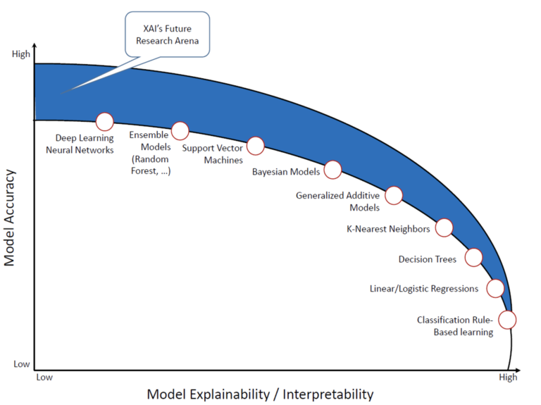
AI harnesses the power of machine learning to perform tasks more efficiently, more accurately or on a bigger scale than people are capable of doing. In chess, AI outperforms masters in terms of speed and skill. Even a supposedly simple task such as online search includes AI, since it can deal with the massive amounts of data that exist on the web. AI models can exhibit different degrees of interpretability, depending on the architecture and data employed. However, in general, more interpretability comes with lower accuracy: the interpretability-accuracy trade-off.
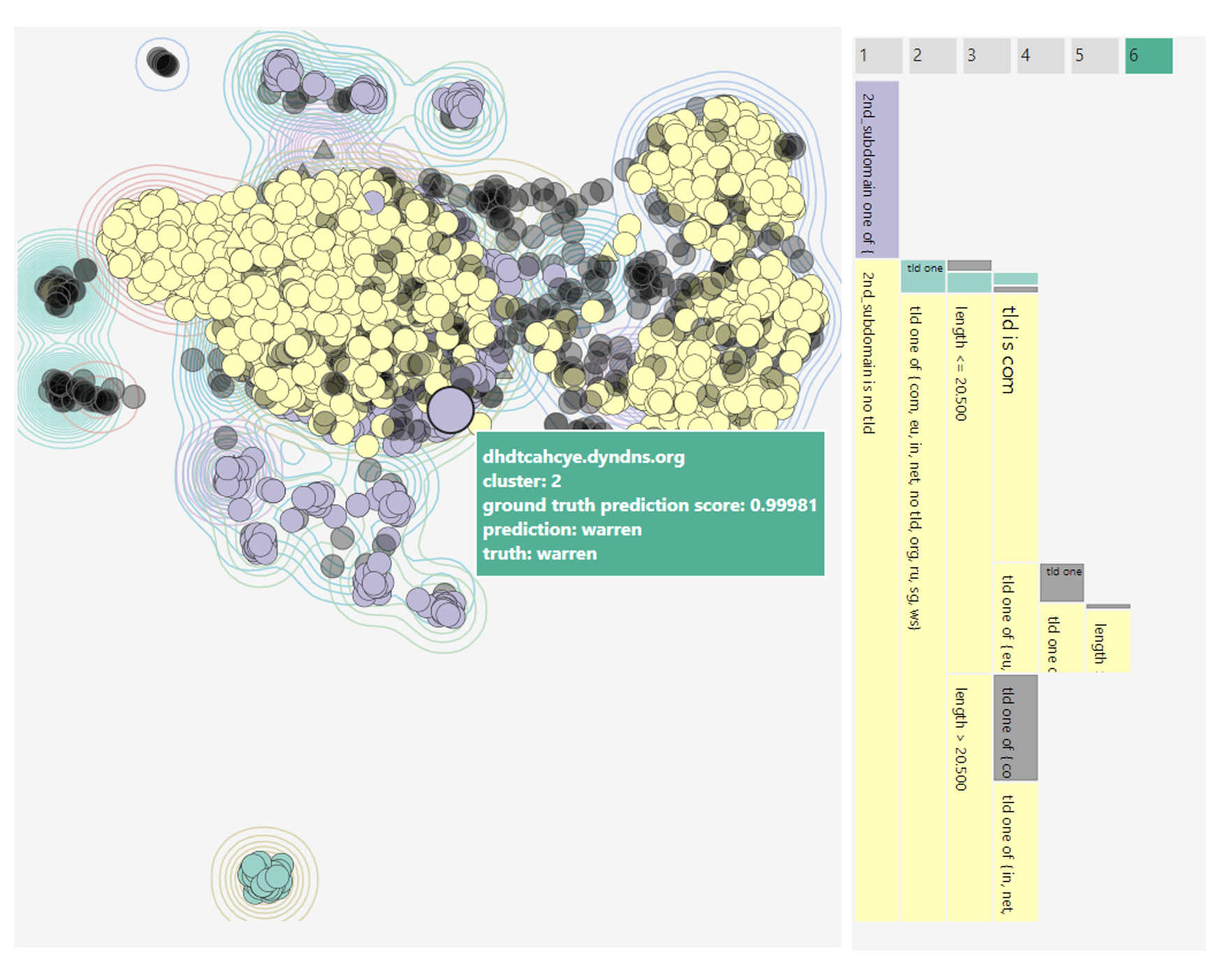
This means that with an increasing desire to integrate high-performance AI in existing systems, interpretability of these models also gains in importance. Visualizations for AI interpretability aim to meet a multitude of goals. They may provide support for model debugging, help users compare and choose between different models or give some kind of explanation for a specific model output. Visualizations can give a detailed and interactive performance analysis, show patterns in model behaviour (see Figure 2) or display outputs from XAI methods like feature visualization or saliency maps.
From the visualization point of view, we need not only consider perceptual mechanisms and rules for good visual encoding that answer our questions, but also how our presentation (including order, emphasis, etc.) and choice of what to visualize affects the viewer’s decision-making process. Research from cognitive psychology (e.g. in Caverni’s book [2]) has shown that people often employ an ever-growing number of cognitive biases. These biases can be characterized as a deviation from the ‘regular’ or ‘rational’ judgement process, though they do not necessarily have to lead to bad judgements. One example for a widely known cognitive bias is anchoring, which describes the (undue) influence an initial anchor has on a final judgement. Nourani et al. [3] have recently shown that users of a system can exhibit such behaviour when asked to judge model outputs. If participants started with cases where the model had obvious weaknesses, they were much more likely to distrust the model, even in cases where the model generally performed well. This can be seen as an example reducing automation bias (trusting automated systems too much) but increasing anchoring bias. Participants significantly underestimated model accuracy when starting with the model weaknesses, but had generally higher task accuracy, so they made less mistakes by relying on the model too much.
Wang et al. [4] suggest that anchoring bias in can be mitigated by showing input attributions for multiple outcomes or providing counterfactual explanations. Interestingly, whether participants were also given an explanation for model outputs did not have a significant effect on task accuracy in Nourani’s study [3]. Whether this is an indicator that the chosen type of explanation does not fit the given task well or that other factors were at fault is an opportunity for further research. In SAPPAN, we are currently conducting a study to see how differences in expertise affect appropriate trust and decision accuracy when using our visualization for DGA (domain generation algorithm) classifiers.
AI will undoubtedly play an integral part in our future. While interpretability is not essential in all areas, if we want to adopt AI techniques more widely and for critical sectors, it is people that need to understand its capabilities and limitations. Consequently, we must consider what visualizations ought to do and how different designs can achieve their goals for specific users. Which biases affect us most when we have to make decisions based on machine outputs and how can systems mitigate these biases? To that end, it is also necessary to further improve our methods of extracting users’ mental models so that we can study the interactions between design and the decision-making process.
References
|
[1] |
A. Duttaroy, „3 X’s of Explainable AI,“ 2021. [Online]. Available: https://www.lntinfotech.com/wp-content/uploads/2021/01/3xExplainable-AI.pdf. [Access: 14 December 2021]. |
|
[2] |
J.-P. Caverni, J.-M. Fabre und M. Gonzalez, Cognitive biases, Elsevier, 1990. |
|
[3] |
M. Nourani et al. „Investigating the Importance of First Impressions and Explainable AI with Interactive Video Analysis“ in CHI EA ’20: Extended Abstracts of the 2020 CHI Conference on Human Factors in Computing Systems. 2020. |
|
[4] |
D. Wang, Q. Yang, A. Abdul und B. Y. Lim. „Designing Theory-Driven User-Centric Explainable AI“ in Proceedings of the 2019 CHI conference on human factors in computing systems. 2019. |
About the author(s): Franziska Becker studied cognitive science and computer science at the University of Osnabrück and is currently a researcher at the Visualization Institute (VIS) at the University of Stuttgart. Her work concerns visualization for AI and the human factors involved in designing such visualization systems.