For security analysts, a picture may be worth more than a thousand words

Dmitriy Komashinskiy and Andrew Patel (WithSecure)
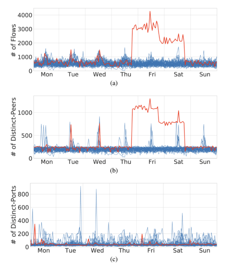
In SAPPAN, we have developed several models for detecting anomalous events in endpoints. For example, we have built a model for identifying anomalous process launch events and a model for identifying anomalous “module load” operations. In order to increase the reliability of detections reported by the models and to support security analysts in handling those detections, we have experimented with combining detected anomalies in so-called provenance graphs. Our hypothesis here is that cyberattacks often result in multiple anomalies involving the same endpoint entities. This blog post presents our initial approach.


Introduction

When developing cyber-attack detection and response mechanisms, finding appropriate trade-offs between often contradictory precision and sensitivity requirements is a serious challenge for two main reasons: (1) exaggerated sensitivity demands lead to an information overload which can cause security analysts to miss attacker activities due to overwhelming noise created by false positives, and (2) exaggerated precision demands, on the other hand, cause the incoming stream of potentially relevant signals to be narrowed down and result in attacker operation detections going unnoticed until it is too late. One way to solve this problem is to develop auxiliary approaches and tools that illustrate how a computer system flagged as “potentially under attack” came to be in that state.

Traditionally, approaches for detecting malware and cyber-attacks are divided into two groups: misuse detection and anomaly detection. Well known examples from the former group rely on descriptions of static and dynamic patterns of attacks that are encapsulated in detection rules written by experts. The latter encompasses various approaches to determining uncommon states and behaviours that include heuristics, statistical methods, machine learning techniques, and so forth.

In SAPPAN, we have developed a set of models designed to detect specific classes of anomalous endpoint behaviour and a method for presenting connections among detected anomalies as a node-edge graph. In this article, we illustrate how our proposed methodology – a combination of elements of state provenance and statistical anomaly detection – can be used to help analysts, threat hunters and incident investigators in their day-to-day activities.

Our approach

A standalone computer system can be thought of as a set of computer programs (further referred to as processes) communicating with each other and the host (endpoint) operating system via various API calls and messaging protocols. Supporting entities and concepts include but are not limited to process address space, synchronization objects, file system, system registry, and network communication primitives. Another important notion – events – captures how processes interact with entities. Event Tracing on Windows and Audit frameworks on Linux can be used to obtain information about the rationales and structures of such events (we are naturally interested in cyber security-relevant ones).

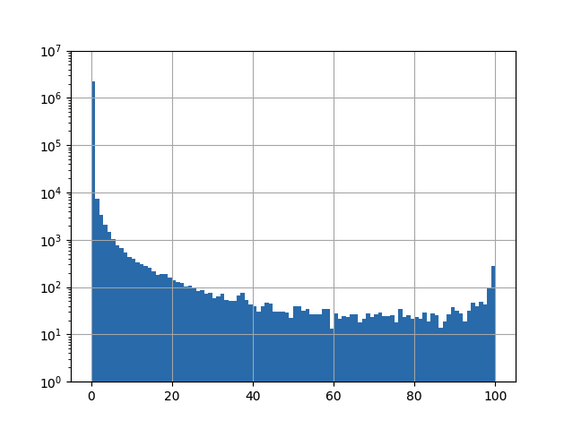
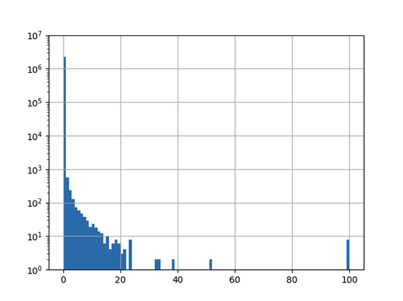
Every distinct event type can be represented in a compact form that includes its subject (used to describe an active process), object (description of an entity the subject interacts with) and attributes of the interaction. We treat each event type separately and design and train dedicated statistical anomaly detection models to categorize events with respect to their anomalousness. Trained anomaly detection models then assess incoming endpoint events in real-time and assign anomalousness categories to those events. In this setting, we assume that events that are valuable from a cyber security perspective possess a certain degree of anomalousness, and we, therefore, treat such events as informative for security analysts. Events identified as common (or normal) are not considered in the scope of this approach and should be handled by other mechanisms.

Our approach firstly collects and identifies anomalous events. Next, a graph is constructed where edges represent anomalous events and nodes represent the subjects and objects of those events.

Figure 1: Examples of node-edge relationships adopted by our methodology

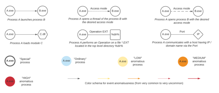
Figure 1 illustrates our adopted notation and presents examples of nodes and edges between processes, shared libraries, file system locations, hosts, registry keys, and so on. Let us consider, for example, a new process creation event type. Both subject and object entities are processes depicted by circles and labeled with the executable image file names. The direction of the edge arrow denotes a parent (subject) to child (object) process relationship. Node and edge colors represent anomalousness. A circle with a solid border represents a process that was found to be involved in suspicious activities by misuse detection logic mechanisms (typically based on rules).

Figure 2: An example provenance graph created from a process tree on an endpoint running Microsoft Windows

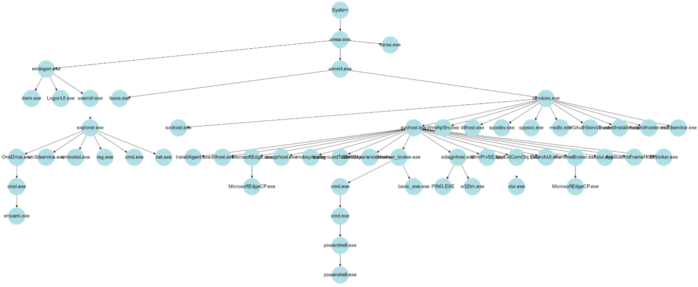
An example of a simple provenance graph is given in Figure 2. In order to collect a node’s state provenance, that node’s path is traced back through the graph to the root node (“System” process in Figure 2). Braun et al. in the paper “Securing Provenance” (2008) define provenance as follows:

“Provenance describes how an object came to be in its present state. Provenance is a causality graph with annotations. The causality graph connects the various participating objects describing the process that produced an object’s present state. Each node represents an object, and each edge represents a relationship between two objects. This graph is an immutable directed acyclic graph.”

For the sake of simplicity, the graph in Figure 2 is trimmed (some processes irrelevant to our example have been removed). The illustrated structure highlights the existence of key system and user processes found at the right and left sides of the graph.

Readers skilled in cyber security matters will notice that the above example represents activities associated with a type of cyber-attack. Misuse detection techniques can be used to identify processes that are commonly involved in cyber-attacks. In the example presented in Figure 2, applying detection of suspicious command line parameters, memory scanning, static and dynamic analysis of executables and processes, and other common misuse detection techniques enable us to highlight suspicious processes with bold borders, and thus derive the graph depicted in Figure 3.

Figure 3: Suspicious processes (as determined by misuse detection methods) highlighted with a bold border.

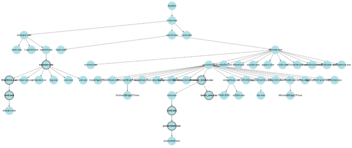
The process chains depicted in Figure 3 that include highlighted suspicious processes allow us to understand the origins of and the actions performed during the attack.

Since rare activities cause rare side effects (that can also be considered rare events), and attack activities are typically rare, we expect attacks to leave “ripples” (i.e., uncommon events that may seem irrelevant) in the log traces of computer systems. Given this fact, we can augment process chains with information regarding statistically uncommon (anomalous) events in order to improve our ability to detect attacks. Some of the edges in a process tree can point to these uncommon events. For instance, in the example depicted in Figure 3, the console applications net.exe and reg.exe usually work in the context of command line interpreters like cmd.exe and powershell.exe. In the illustrated process tree, however, we see that they were instead called directly by the program manager process – explorer.exe. Although it is wrong to assume that such explorer.exe behaviour is reliably indicative of an attack, it is useful to highlight such an observation to security analysts, especially in uncertain cases.

A number of event types exist that can be utilized to augment a process tree. These provide a backbone for defining connections between the main subjects (processes) of interesting events that can occur on a computer system. Figure 4 illustrates how uncommon new process, open process, network connection, and file access events “group together” in the process trees shown in the previous Figures. Note that the provided illustration does not completely conform to the provenance graph requirement that these graphs be directed and acyclic.

Figure 4: The color-coded provenance graph presented to security analysts

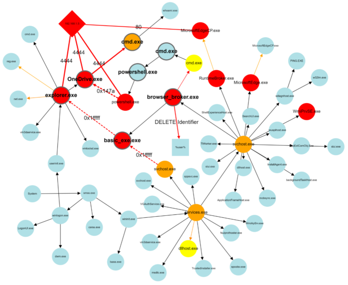
A security analyst can quickly and easily read a graph such as the one presented in Figure 4 to understand how a computer system came to its present (suspicious) state and thus understand whether an attack is ongoing, and if so, identify affected processes and entities. Colored edges in the illustration point to anomalous events, and colored circles represent entities (processes, IP addresses) observed in anomalous contexts. This graph representation provides security analysts with rich context, enabling faster decision making and supporting in response actions planning. It has often been noted that a picture is worth a thousand words. For security analysts facing increasing alert fatigue, these pictures may be worth a whole lot more.

About the authors:

Dmitriy Komashinskiy is Lead Researcher at WithSecure Tactical Defense unit and focuses currently on the core analytics functionality of WithSecure’s attack detection and response services. Before joining WithSecure, Dmitriy worked in several companies in the information security area as well as at the Computer Security Laboratory of Saint-Petersburg Institute for Informatics and Automation, from where he received PhD degree in Information Security. He authored a number of papers and patents in the cybersecurity domain.


Andrew Patel is an artificial intelligence researcher at WithSecure. His areas of specialty include social network and disinformation analysis, graph analysis and visualization methods, reinforcement learning, natural language processing, and artificial life. Andrew is a key contributor to the AI section of the WithSecure blog.


Modeling Host Behavior in Computer Network

By Tomas Jirsik (Institute of Computer Science, Masaryk University)

An analysis of a host behavior is an essential key for modern network management and security. A robust behavior profile enables the network managers to detect anomalies with high accuracy, predict the host behavior, or group host to clusters for better management. This blog introduces basic features for host behavior that can be obtained from network traffic and provides initial insights into long-term host behavior gained by analysis of host behavior over one year.

Network traffic monitoring is a rich source of information on host behavior. The passive large-scale approaches to traffic monitoring, such as network flow monitoring [1], enable us to observe a behavior of a large number of hosts in a network without the necessity to have direct access to these hosts. Current network monitoring approaches can provide information on each connection, even in high-speed networks, without any sampling.  

The data retrieved by network monitoring tools from network traffic represents individual connections (either one- or bi-directional). However, these network connections need to be transformed into features properly embedding the hosts behavior. Table 1 presents the basic features that can be extracted from the network connection records provided by a majority of the network monitoring tools.  

Table 1: Features for modeling host behavior

The models of host behavior can capture various aspects of host behavior. A commonly modeled behavior element includes temporal characteristics of the behavior, volumetric nature of the behavior, and last but not least, the usual habits of a user such as frequently visited domains, AS, or countries. More advanced analyses of the host behavior can focus on the identification of the stability of the host behavior, anomaly detection, behavior change detection, or host clustering.

Figure 1: Analysis of the temporal patterns of host behaviors.

Figure 1 provides an example of the analysis of active communication times for hosts in different types of subnets in a network over a year. A line in the figure represents a share of a single host’s active observations in a year. The diurnal pattern with the peak at noon and a smaller peak at 3 AM are present in the segment containing mainly work stations of regular workers (SUB_WORK). The peak culminating at noon represents the typical daylight activity. The smaller peak at 3 AM is caused by the updates of the workstations planned by the central management system. Similarly, the weekday pattern is observable at the SUB_WORK, which reflects the fact that the majority of the hosts in the SUB_WORK subnets are used by the employees of the university. Hosts in the server segment (SUB_SERV), on the other hand, do not show any significant diurnal pattern. 

Modeling the stability of the host behavior aims to identify hosts with unstable (i.e., irregular, more random) and differentiate them from the hosts that behave consistently in time. We can then work with the assumption that the hosts with consistent behavior in time usually pose a lower risk and do not be monitored in greater detail compared to the hosts with inconsistent behavior. The figures below present selected use-cases that can be identified using the host behavior models derived from their network behavior.

Figure 2: Model based on # of Flows can identify behavior change in traffic volume of a host, (a) behavior of a host over a year, (b) modeled week profiles of the host.
Figure 3: Model based on # of Flows can identify behavior change in active times. From January to March, the host communicates only in working hours, while from May, the hosts start communicating 24/7.
Figure 4: A suspicious behavior of a host indicating outgoing horizontal scanning in one week in a year (multiple connections on multiple hosts without the increase in a number of different ports contacted).

CONCLUSION

The examples shown in the blog provide only a glimpse of the possibilities of modeling the host behavior based on the data captured from network traffic. The host behavior modeling can be efficiently applied in various areas of network management, such as network segmentation, network policies settings, or even cybersecurity incident prioritization. All examples presented in the blog are explained and described in detail in [2], along with an open-source dataset of one-year host behavior data available on a public repository.

References:

[1]: R. Hofstede et al., “Flow Monitoring Explained: From Packet Capture to Data Analysis With NetFlow and IPFIX,” in IEEE Communications Surveys & Tutorials, vol. 16, no. 4, pp. 2037-2064, Fourthquarter 2014, doi: 10.1109/COMST.2014.2321898. 

 
[2]: T. Jirsik and P. Velan, “Host Behavior in Computer Network: One-Year Study,” in IEEE Transactions on Network and Service Management, vol. 18, no. 1, pp. 822-838, March 2021, doi: 10.1109/TNSM.2020.3036528. 

About the author(s):

Tomas Jirsik received the Ph.D. degree in informatics from the Faculty of Informatics, Masaryk University, Czech Republic. He is currently a Senior Researcher with the Institute of Computer Science, Masaryk University and a Member of the Computer Security Incident Response Team, Masaryk University, where he leads national and international research projects on cybersecurity. His research focus lies on the network traffic analysis with a specialization in host profiling. His research further includes network segmentation approaches via machine learning and host fingerprinting in network traffic. 


Analytic provenance for security operation centres

Robert Rapp (University of Stuttgart)

An important part of incident response is still an analytical process to understand the cause of an incident and select response actions. Using therefore visualisations in security operation centres (SOC) can improve the alert triage of analysts by visual analytics to handle tons of alerts each day. Such an analysis requires a good understanding of cyber attacks and experiences to detect suspicious patterns in visualisations. However, this analytical process happens in the mind of analysts and cannot easily be transferred to others. Understanding the reasons for user insights and their manner is most relevant and challenging for analytical provenance.

In SAPPAN we have researched on analytical provenance in visualisations to make such an analysis comprehensible. Similar to data provenance that captures the traceability information about where data comes from and how the data was manipulated over time, we capture information about the visualised data and interactions applied in visualisations. To expand the SOC analysts’ opportunities within the SAPPAN dashboard, we created a tool to record interactions and use the recorded data to visualise the sequence of user activities. 

This approach allows analysis sessions to be interpreted and understood by both humans and machines, making them comparable and suitable for various applications.

The figure below shows in a graphical interface a recorded sequence of interactions. The lanes show different sources of interactions like the visualisations used for analysis or the comment box to annotate insights. Between a start and end circle, the rectangles called Task show that different filters have applied to the data to manipulate the representation. To gain further insight into the analysis, a user can click on the rectangles to see what the visual representation in the dashboard looked like at the time of recording.

Figure 1: Graphical representation of an analysis session with interactions recorded in different visualisations interpretable by both humans and machines

With that approach, a user can recap the interactions that lead to an analysis result, share it or use it to improve processes where necessary. If analytical provenance is thought of even further, recommendations for handling can be derived from it and clustered for specific attacks. With that, a SOC can compare their analysis sessions and use them to a shared knowledge base in malware analysis.

Challenges in Visualization for AI

By Franziska Becker (University of Stuttgart, Institute for Visualization and Interactive Systems)
Artificial intelligence (AI) is one of the buzzwords that defined many conversations in the last 5-10 years. Especially in regards to technology, “Can we use AI to improve our product?” is not an uncommon question. With these conversations come issues concerning interpretability and explainability of AI models. Visualization can offer one way of approaching these topics, but also introduces new challenges, like effects of and on cognitive biases.

AI harnesses the power of machine learning to perform tasks more efficiently, more accurately or on a bigger scale than people are capable of doing. In chess, AI outperforms masters in terms of speed and skill. Even a supposedly simple task such as online search includes AI, since it can deal with the massive amounts of data that exist on the web. AI models can exhibit different degrees of interpretability, depending on the architecture and data employed. However, in general, more interpretability comes with lower accuracy: the interpretability-accuracy trade-off.

Figure 1: The interpretability-accuracy trade-off showing that models’ accuracy decreases as their interpretability increases, figure taken from Duttaroy [1].

This means that with an increasing desire to integrate high-performance AI in existing systems, interpretability of these models also gains in importance. Visualizations for AI interpretability aim to meet a multitude of goals. They may provide support for model debugging, help users compare and choose between different models or give some kind of explanation for a specific model output. Visualizations can give a detailed and interactive performance analysis, show patterns in model behaviour (see Figure 2) or display outputs from XAI methods like feature visualization or saliency maps.

Figure 2: Example visualizations from a SAPPAN prototype for a DGA classifier showing a 2D projection of activations (left) that are clustered using HDBSCAN, and a decision tree (right) that gives a local explanation for these clusters.

From the visualization point of view, we need not only consider perceptual mechanisms and rules for good visual encoding that answer our questions, but also how our presentation (including order, emphasis, etc.) and choice of what to visualize affects the viewer’s decision-making process. Research from cognitive psychology (e.g. in Caverni’s book [2]) has shown that people often employ an ever-growing number of cognitive biases. These biases can be characterized as a deviation from the ‘regular’ or ‘rational’ judgement process, though they do not necessarily have to lead to bad judgements. One example for a widely known cognitive bias is anchoring, which describes the (undue) influence an initial anchor has on a final judgement. Nourani et al. [3] have recently shown that users of a system can exhibit such behaviour when asked to judge model outputs. If participants started with cases where the model had obvious weaknesses, they were much more likely to distrust the model, even in cases where the model generally performed well. This can be seen as an example reducing automation bias (trusting automated systems too much) but increasing anchoring bias. Participants significantly underestimated model accuracy when starting with the model weaknesses, but had generally higher task accuracy, so they made less mistakes by relying on the model too much.

Wang et al. [4] suggest that anchoring bias in can be mitigated by showing input attributions for multiple outcomes or providing counterfactual explanations. Interestingly, whether participants were also given an explanation for model outputs did not have a significant effect on task accuracy in Nourani’s study [3]. Whether this is an indicator that the chosen type of explanation does not fit the given task well or that other factors were at fault is an opportunity for further research. In SAPPAN, we are currently conducting a study to see how differences in expertise affect appropriate trust and decision accuracy when using our visualization for DGA (domain generation algorithm) classifiers.

AI will undoubtedly play an integral part in our future. While interpretability is not essential in all areas, if we want to adopt AI techniques more widely and for critical sectors, it is people that need to understand its capabilities and limitations. Consequently, we must consider what visualizations ought to do and how different designs can achieve their goals for specific users. Which biases affect us most when we have to make decisions based on machine outputs and how can systems mitigate these biases? To that end, it is also necessary to further improve our methods of extracting users’ mental models so that we can study the interactions between design and the decision-making process.

References

[1]

A. Duttaroy, „3 X’s of Explainable AI,“ 2021. [Online]. Available: https://www.lntinfotech.com/wp-content/uploads/2021/01/3xExplainable-AI.pdf. [Access: 14 December 2021].

[2]

J.-P. Caverni, J.-M. Fabre und M. Gonzalez, Cognitive biases, Elsevier, 1990.

[3]

M. Nourani et al. „Investigating the Importance of First Impressions and Explainable AI with Interactive Video Analysis“ in CHI EA ’20: Extended Abstracts of the 2020 CHI Conference on Human Factors in Computing Systems. 2020.

[4]

D. Wang, Q. Yang, A. Abdul und B. Y. Lim. „Designing Theory-Driven User-Centric Explainable AI“ in Proceedings of the 2019 CHI conference on human factors in computing systems. 2019.

About the author(s): Franziska Becker studied cognitive science and computer science at the University of Osnabrück and is currently a researcher at the Visualization Institute (VIS) at the University of Stuttgart. Her work concerns visualization for AI and the human factors involved in designing such visualization systems.

Datasets Quality Assessment For Machine Learning

By Dominik Soukup (CESNET)

Have you ever heard about Machine learning (ML)? Probably yes, ML is a popular technique for network traffic classification and incident detection. However, have you ever heard about evaluating the quality of datasets (QoD)?
QoD is becoming more important with deployment ML in production, and project SAPPAN contributes to this topic.

The main prerequisite for any ML model is the input dataset that is used for training. If the input dataset contains mistakes and irrelevant data, the ML model cannot work correctly too. Moreover, the network traffic domain is a dynamic environment where patterns can change dynamically over time, and each network is also different. Therefore we need to take care of our datasets, measure their quality and improve them if necessary.


Currently, many authors publish public datasets but with limited descriptions. Therefore, we need to primarily trust the author’s reputation instead of verifying its quality for our network. The decision if we can use the available public dataset or create our own is repeated anytime we want to use the ML algorithm. This decision is not easy since there is no standardized way to evaluate the QoD.


Our recent study [1] is focused on initial definitions of dataset quality and proposes a novel framework to assess dataset quality. We introduce the following definitions that we are missing for standardized description of dataset quality: Good Dataset, Better Dataset, and Minimal Dataset. In Figure 1. you can see the high level architecture of our novel framework that we used for experiments to measure datasets quality.

Figure 1: High-level design of the framework for Quality of Datasets evaluation.

The aim of this framework is to find weaknesses and evaluate the quality of datasets with respect to the particular environment and domain. At the first stage, input datasets are statically tested to do an initial check of dataset format and Good dataset conditions. The second stage (Weakness analysis) is doing a dynamic evaluation of the dataset. Together with input metadata about the domain and ML model, we generate different datasets to see their bias. In the last stage, we compare different versions of generated datasets and optionally input datasets with each other to identify a better dataset. The output of the proces is a quality report with results, recommendations, and further optimization.


In the next steps, we would like to focus on the generation of datasets and the annotation pipeline that will automatically and continuously build our datasets and evaluate dataset quality. It is more important to generate and optimize a dataset for each target network than to leverage untrusted public datasets that do not have to match the patterns in our network. We are looking forward to pursuing the planned experiments and sharing our results.

References:

[1] D. Soukup, P. Tisovčík, K. Hynek, T. Čejka: “Towards Evaluating Quality of Datasets for Network Traffic Domain”, 17th International Conference on Network and Service Management (CNSM), 2021. To be published.

Detecting suspicious *.ch-domains using deep neural networks

By Mischa Obrecht (Dreamlab Technologies AG Switzerland)
The SAPPAN consortium has been researching several different use cases for new detection methods, such as the

classification of phishing websites or algorithmically generated domains (AGDs). Both topics were tackled using deep neural

network classifiers, achieving good accuracy on training and validation data mostly based on the English language. In this

article, we use the aforementioned models to classify the *.ch domain space which was recently made public by the entity

managing the .ch and .li country-code top-level domains for Switzerland and Lichtenstein (switch.ch).

As switch.ch recently published the .ch-zonefile [1], we have access to a snapshot of all registered *.ch domains, including all the domains that may never have been configured to resolve to an IP, are not linked to by any websites or webservices and are thus not discovered by web-crawlers like Google.

Modern remote controlled malware (so called remote access toolkits, that are widely used by advanced persistent threats, APTs) communicates with its handler. This is called command and control (C2). In most cases the malware will contact a public rendezvous server or public proxy (e.g. a virtual private server on AWS) to obtain instructions from its handler in more or less regular intervals. This is called beaconing.

Figure 1: A typical setup of modern remote controlled malware (based on illustration from https://poshc2.readthedocs.io/en/latest/install_and_setup/architecture.html)

Since the malware communicates with its handler (the beaconing), the communication peer for this communication is a weak spot for the attacker. In the early days of malware development the communication peers used to be hardcoded and could easily be blocked. Nowadays domain generating algorithms that can reliably create domains from given input values (the seed values) are used, instead of hardcoded values. These algorithms work deterministically in the sense that a given input or seed value will always produce the same output domain:

Figure 2: Illustration of domain generation algorithm (DGA)

If the malware operator uses the same algorithm and same seed values, the required domains can be registered ahead of time and the respective domains configured, to resolve to one or more C2 proxies. This approach makes it a lot more difficult to extract meaningful IOCs from captured malware samples and thus blacklist the corresponding malware traffic. 

The complete setup looks as follows:

Figure 3: A typical setup involving malware comunicating with its command and control (C2) infrastructure by using domain generation algorithms

Many recently discovered threat actors have been using the abovementioned approach for their C2 communication. Examples are:

  • The recently documented Flubot campaign, targeting Android devices, [2]
  • The Solarwinds/Sunburst APT, [3]

Our goal is to find a self contained way for automatically identifying such suspicious domains in the .ch-zone almost exclusively based on information contained in the domain-name itself. For this we use the DGA detectors studied in SAPPAN. 

In a first, naïve try we applied a model trained on global training data to classify the full 2.3 million domains found in the .ch-zonefile:

Figure 4: Results of applying the convolutional neural network trained on the global training set to the .ch-zone, 101 bins, log10-scaled y-axis.

Bin

Number of domains in bin

[0,25)

2257416

[25,50)

1347

[50,75)

675

[75,100]

1024

The x-axis shows the classification certainty and the y-axis the number of domains that were classified in a certain bin regarding certainty.In order to do anything meaningful with these results, one has to pick a cutoff to create a shortlist of domains to be analyzed closer. Given above results, it is not possible to pick a feasible cutoff, because almost any cutoff will lead to a candidate list that is way too long.

A quick look at the results shows some interesting false positives, especially towards the end of the last bin (“feuerwehr” means fire brigade in German and the second to last line is a Swiss-german sentence):

By carefully enhancing the training data to intricacies of the public .ch-zonefile, it is however possible to improve the classification accuracy tremendously. To this end all .ch domains that had an MX-record in the zonefile were added to the benign training set and then the classifier was retrained. This leads to a much better distribution of the resulting classifications:

Figure 5: Result of applying the convolutional neural network trained on the specialized dataset to the .ch-zone, 101 bins, log10-scaled y-axis.

Bin

Number of domains in bin

[0,25)

2260430

[25,50)

13

[50,75)

6

[75,100]

13

Now all domains that get classified with a certainty of for example more than 50% can be examined manually. 

We’ll leave it to the reader to take a look at the following, resulting candidate list:

Domain

Certainity

(model output)

abcdefghijklmnopqrstuvwxyz.ch

100%

adslkfalkfjlkfjdsalkfafljflsa.ch

100%

8qswldnsrvb73xkczdyj.ch

99.9%

rgdfgdfgdfgdf.ch

99.9%

utitan101310bgfhnythjdukfdyjt.ch

99.8%

sfdfgdfgdfgdfgdfg.ch

99.8%

n7q9ipiddq9ihtx.ch

99.1%

testhgfjdgdfxhgxdfhx12.ch

99.1%

oiqweurpui345345jk.ch

94.1%

ymfvrcnwyw.ch

92.5%

aqddddwxszedc.ch

84.8%

ihjj8qltfyfe.ch

82.2%

asdfjkhdsfajdfsajhsadf.ch

77.1%

7as6q796d6s98q6qd6sdq.ch

72.6%

rggrgrgrgrgrgr.ch

66.5%

fj6f8j1gbwzl.ch

54.6%

fdsafdahkjfdhajkfdas.ch

52.2%

xczjhkgdsadsa.ch

51.3%

ik48lsu5dww485letzk9m7f.ch

51.1%

Conclusion:

Above method appears to work to identify a manageable number of suspicious domains (19 domains), from a very large dataset (2.3 million domains). There still appear to be false positives in this set but at the end of the day, this process of automatically identifying highly suspicious candidates and then manually investigating them is exactly what happens in security operation centers all over the world. Usually, however, with a much higher number of false positives and a much higher number of alerts.

One concern is, that 19 out of 2.3 million domains seems to be a rather low ratio of detections. This can be countered by lowering the classification threshold to lower percentages (below 50%) which in turn most likely would increase the number of false positives. In a production setting, the optimal detection threshold would have to be investigated further.

Given the results of manually inspecting the suspicious domains, we believe it would well be worth an analyst’s time to perform the manual analysis of domains that are detected in this way.

References:

[1]: https://securityblog.switch.ch/2020/11/18/dot_ch_zone_is_open_data/
[2]:
https://securityblog.switch.ch/2021/06/19/android-flubot-enters-switzerland/
[3]:
https://www.fireeye.com/blog/threat-research/2020/12/evasive-attacker-leverages-solarwinds-supply-chain-compromises-with-sunburst-backdoor.html

About the author(s):

Mischa Obrecht works as a cyber-security specialist in various roles for Dreamlab Technologies. He thanks Jeroen van Meeuwen (Kolabnow.com) and Sinan Sekerci (Dreamlab) for sharing their ideas, time and advice, while contributing to above research.

He also thanks Arthur Drichel from RWTH Aachen for sharing advice and an initial POC implementation of the convolutional neural network.

Sharing of incident response playbooks

By Martin Žádník (CESNET)
As an incident handler, have you wondered whether the way how you deal with a cybersecurity incident can be improved, how others deal with the same issues, whether the handling can be automatized? If yes, you are not alone. There is a whole community working on a standard to express incident response playbooks and SAPPAN contributes to the effort.

From what I had the opportunity to observe, incident handling is in a majority a repetitive work. A reaction to a large portion of incidents is the same. I mean the reaction vary, based on the incident, but similar incidents happen again and again and the reaction to a similar incident follows the same pattern.

Now imagine similar incidents happen all over the world constantly. Wouldn’t it be great if these “boring” incidents were not handled individually and manually? I wish there was a pool of knowledge on how to react to these incidents. Then the pieces of such knowledge can be shared, with some customization, deployed in the infrastructure and automatically executed.

The representation of incident handling is the key enabler to sharing. Since recently, I have not come across any standard to represent incident handling procedures. Organizations use either high-level playbooks which are human readable (e.g. Figure 1) but not machine readable, or scripts which are machine readable but not interoperable across organizations nor shareable and hard to understand by a human. I was simply missing a standard that would fit both worlds – human readable but with a structure that would allow for transforming the playbook into the instructions for a machine.

Figure 1: An example of a high-level playbook: simple DGA playbook

The SAPPAN project sets one of its goals to share incident handling information. While I was working on this goal, I came across the standardization effort organized within OASIS – Collaborative Automated Course of Action Operations for Cyber Security Technical Committee [1]. This is exactly what I was looking for, I said to myself when I first read the draft of the standard. Since I work with MISP (Malware Incident Sharing Platform [2]) as the main sharing platform, I decided to prepare a MISP data model for the CACAO playbooks. I got in touch with the committee, and we thoroughly discussed various alternatives how to best model the CACAO playbooks in MISP.

In the end, we decided to take a straight-forward approach and prepared a MISP playbook object with specific attributes only for the playbook metadata. The whole CACAO playbook is stored as an attachment attribute in the object. This allows to share also other playbook formats and does not require the transformation of the playbooks when it is shared and exported. Also, we discussed the playbook object with the MISP developers, and I am happy to announce it is now available in the official MISP object repository [3] so that we can start to test its interoperability with other partners.

I am looking forward to the growth of the playbook sharing community, be it either publicly available or shared only within the closed communities of cybersecurity intelligence vendors and their customers.

References:

[1] OASIS Collaborative Automated Course of Action Operations (CACAO) for Cyber Security TC. CACAO Security playbooks specification v1.0, available online: https://docs.oasis-open.org/cacao/security-playbooks/v1.0/cs01/security-playbooks-v1.0-cs01.html

[2] MISP – Open Source Threat Intelligence Platform & Open Standards For Threat Information Sharing, available online: https://www.misp-project.org

[3] MISP repository, available online: https://github.com/MISP/misp-objects/pull/324#issue-1009464958